NSK Brand ID
NSK Brand ID
NSK Brand ID
“who are you, when the spotlight shines?”
“who are you, when the spotlight shines?”
“who are you, when the spotlight shines?”
2022
2022
2022


Brief
Brief
Brief
NSK Theatersports, short for "Nederlandstalig studenten kampioenschap Theatersports," stands as the premier Dutch-spoken student theatre improv event in the Netherlands and Belgium. It is a grand spectacle where creativity and spontaneity converge. In the year 2022, I had the honor of assuming the role of head of promotion and design, for the 30th edition, tasked with shaping the event's identity.
special thanks to superformosa for the event pictures
Description
The central theme I envisioned for this edition revolved around the actors revealing a side of themselves that remains hidden off-stage. It was a representation of the personas they embody on stage. The raw emotions they display on stage are reflected in the worn aesthetics.

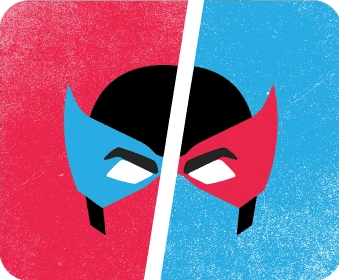
The mask serves as a symbol of transformation and duality. The contrasting color scheme doubles down on the duality by being split in half by a bold white slash. These graphical elements were the basis of the event's branding and were incorporated in different aspects of the event.
The mask serves as a symbol of transformation and duality. The contrasting color scheme doubles down on the duality by being split in half by a bold white slash. These graphical elements were the basis of the event's branding and were incorporated in different aspects of the event.

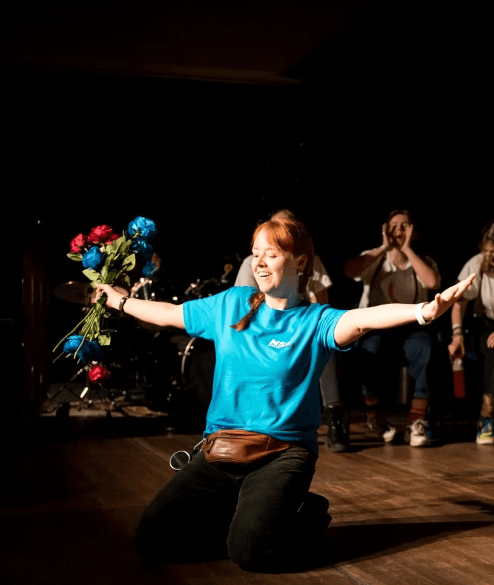
Traditionally, red roses are thrown by the audience, but this year I wanted to incorporate the theme, so I ordered additional blue roses. To maintain the red and blue element, I decided to split the volunteer outfits into a blue and red half. Those same volunteers were given custom reusable water bottles with a print of the logo as a thank-you gift. I ordered the board hoodies with prints and then customized them by personally making the red and blue split pull cords as the final detail.
Traditionally, red roses are thrown by the audience, but this year I wanted to incorporate the theme, so I ordered additional blue roses. To maintain the red and blue element, I decided to split the volunteer outfits into a blue and red half. Those same volunteers were given custom reusable water bottles with a print of the logo as a thank-you gift. I ordered the board hoodies with prints and then customized them by personally making the red and blue split pull cords as the final detail.

For the promotional strategy, I would like to highlight the approach I used for posters. Due to the relatively unknown nature of the event and art form, I chose to poster in multiple rounds. First, a bold and minimal teaser poster was created. The main goal of this poster was to get people to see it and remember the visual style. Since the poster didn't contain information besides a date, the time they would see the second poster round, which contained all the information, would satisfy their curiosity about what the first poster was all about.
For the promotional strategy, I would like to highlight the approach I used for posters. Due to the relatively unknown nature of the event and art form, I chose to poster in multiple rounds. First, a bold and minimal teaser poster was created. The main goal of this poster was to get people to see it and remember the visual style. Since the poster didn't contain information besides a date, the time they would see the second poster round, which contained all the information, would satisfy their curiosity about what the first poster was all about.

This event gave me the ability to use my diverse set of technical skills. Due to budgetary constraints, we opted to order entry wrist straps without a customized print. To still add some personalization, I made a 3D folding printed jig that allowed us to rapidly stencil the wrist straps in a repeatable way. The next challenge was that, due to the nature of the event, the shows run in parallel and with multiple teams of judges. This makes keeping track of the scores and updating them a challenge. Added to that is that it isn't always clear for the audience to find out which teams are playing in which theater. I took this challenge upon myself and developed a live updating score board that automatically showed which teams were playing where and what the scores were. I did this by dipping my toes in React.js and Electron.
This event gave me the ability to use my diverse set of technical skills. Due to budgetary constraints, we opted to order entry wrist straps without a customized print. To still add some personalization, I made a 3D folding printed jig that allowed us to rapidly stencil the wrist straps in a repeatable way. The next challenge was that, due to the nature of the event, the shows run in parallel and with multiple teams of judges. This makes keeping track of the scores and updating them a challenge. Added to that is that it isn't always clear for the audience to find out which teams are playing in which theater. I took this challenge upon myself and developed a live updating score board that automatically showed which teams were playing where and what the scores were. I did this by dipping my toes in React.js and Electron.